
For my own amusement and also to show my wife where I have been I use the Swarm check-in app on my phone and check-in to places. Also for my own amusement I used PowerBi to visualise the data via the API and allow me to filter it in various ways.
Whilst at the PowerShell Conference in Asia I was showing the mobile app to a group over some food and saying how easy it was and June Blender, the mother of PowerShell help, said that I ought to blog about it. So I have 🙂
Follow these steps and you can create this report.
 and add your own access token to it should you wish. Details at the end of the post
I am using the swarm API but the principle is the same for any other API that provides you with data. For example, I used the same principles to create the embedded reports on the PASS PowerShell Virtual Chapter page showing the status of the cards suggesting improvements to the sqlserver module for the product team to work on. Hopefully, this post will give you some ideas to work on and show you that it is quite easy to get excellent data visualisation from APIs
First up we need to get the data. I took a look at the Swarm developers page ( The Trello is here by the way) I had to register for an app, which gave me a client id and a secret. I then followed the steps here to get my user token I was only interested in my own check ins so I used the steps under Token flow Client applications to get my access token which I used in an URL like this.
https://api.foursquare.com/v2/users/self/checkins?limit=5000&oauth_token=ACCESS_TOKEN&v=YYYYMMDD
I added the limit 5000 as the default number of checkins returned was too small for my needs and the date was that days date.
You can do this in Powershell using code I got from the magnificent Stephen Owen’s blog post
| |
I checked the URL in a browser and confirmed that it returned a json object. Keep that URL safe you will need it in a minute. That code above has placed it in your clipboard. If you want to jump straight to the report using the download stop here and go to the end
So now lets move to Power BI. Go to powerbi.com and download the PowerBi Desktop. Its free. You will need to create an account using a school or work email address if you wish to put your reports in powerbi.com
Once you have downloaded and installed PowerBi Desktop you will be faced with a window like this

Start by clicking Get Data

Then choose Web and paste the URL from above into the filename and press ok which will give you this

Now we need to put the data into a format that is of more use to us

I clicked on the record link for response, then converted to table, then the little icon at the top of the column to expand the value.items column and then the value.items column again. It doesn’t look much yet but we are a step closer.
Next I looked in the table for the venue column, expanded that and the location column and the formatted address column.

You can also expand the categories so that you can look at those too by expanding Value.items.venue.categories and Value.items.venue.categories1

Now you will see that we have some duplicates in the data so we need to remove those. I did that by deleting the first 3 columns and then clicking remove duplicates under Delete Rows

Then click close and apply. Then click on the data button as we need to rename and remove some more columns so that our data makes a little sense. I renamed the columns like this
- Value.items.createdAt –> CreatedAt
- Value.items.shout –> Comment
- Value.items.venue.name –> VenueName
- Value.items.venue.location.address –> VenueAddress
- Value.items.timeZoneOffset –> TimeZoneOffset
- Value.items.venue.location.lat –> VenueLat
- Value.items.venue.location.lng –> VenueLong
- Value.items.venue.location.postalCode –> VenuePostalCode
- Value.items.venue.location.cc –> CountryCode
- Value.items.venue.location.city –> City
- Value.items.venue.location.state –> State
- Value.items.venue.location.country –> Country
- Value.items.venue.location.formattedAddress –> VenueAddress
- Value.items.venue.url –> VenueURL
- Value.items.venue.categories.name –> Catogory
- Value.items.venue.categories.pluralName –> Categories
and remove all of the other columns. You can also do this in the Edit Queries window, I am just showing you that there are multiple ways to do the same thing

Once you have done that you should have a window that looks like this. Notice I renamed the query to checkins as well

Now we need to create a calculated column for the time and a measure for the count of checkins. This is done using this code
Time = VAR UnixDays = [createdAt]/(60*60*24)
RETURN (DATEVALUE("1/1/1970")+UnixDays)
CountCheckins = COUNT(checkins[Time])
and we can move onto the report side of things. Frist we are going to download a custom visual. Go to the PowerBi Custom Visuals Page and download the Timeline visual
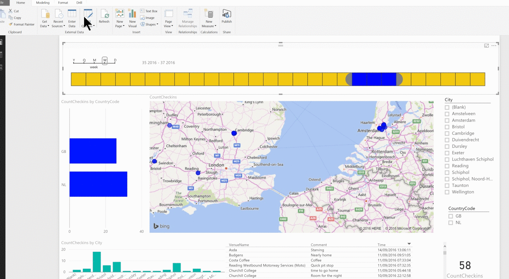
and then import it into your PowerBi report. I have embedded a YouTube video below showing the steps I took to turn this into the PowerBi report. Its pretty easy, you will be able to click on the visuals and then click on the data columns and alter them until you have the report that you want.
Once you have done this, you can upload it to PowerBi if you wish by clicking on the Publish button in PowerBi desktop and signing into PowerBi.com with your work email address.
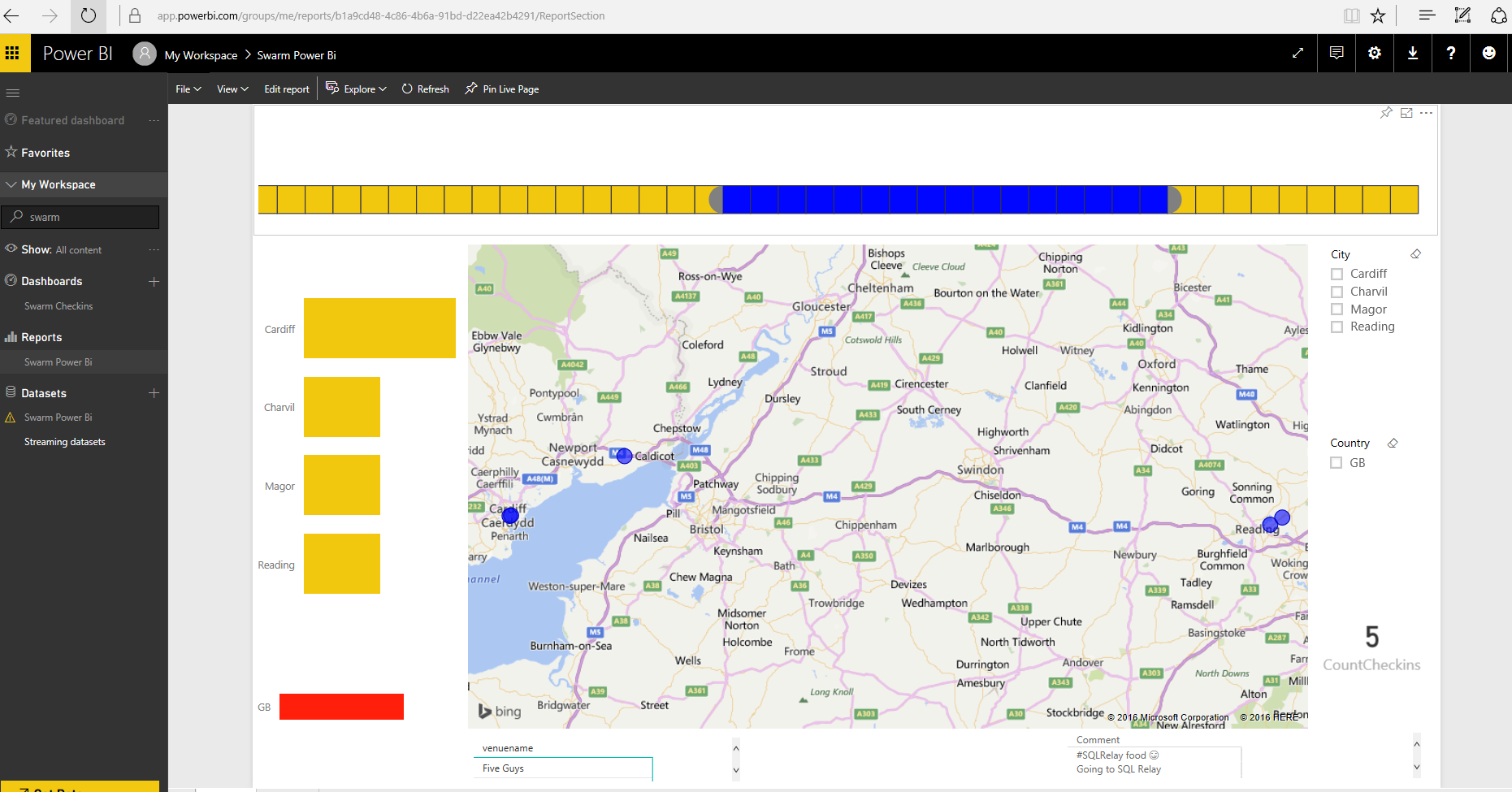
and your report is available for you on PowerBi.com 🙂 By clicking on the pins on a visualisation you can add them to a dashboard.

Once you have a dashboard you can then use the natural language query to ask questions of your data. Here are some examples
How many checkins are in GB
How many checkins are in airports
How many checkins by month
How many checkins by month in GB
Which airports
Show me hotel venuename and time
How many hotels by country
Show me hotel venuename and checkins count
metro stations venuename and count checkins as a map
Show me count checkins in Amsterdam by category as a donut

If you want to use the blank report, download it from here open it in PowerBi Desktop, click Edit Queries and Source and add your own URL and click Apply and then Refresh
Hopefully, this has given you some ideas of ways that you can create some reports from many of the data sources available to you via API