Following my post about using Power Bi with my DBA Database I have been asked if I would share the PowerShell scripts which I use to populate my database.
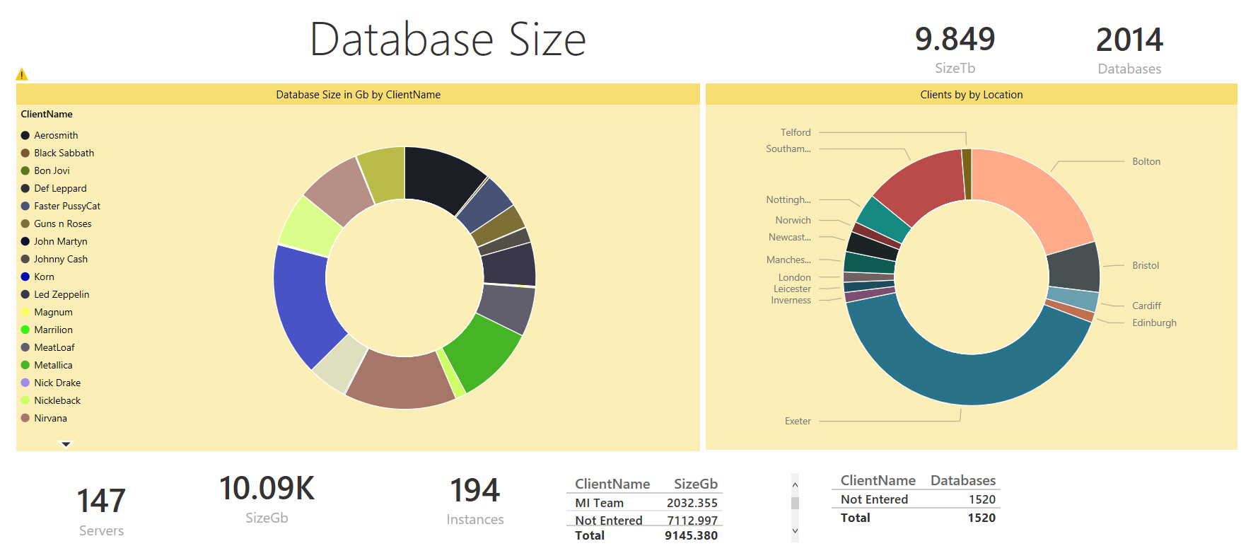
In this post I will show how to create the following report
Although you will find so many items of data that I expect that you will want to create different reports for your own requirements. You will also want to put the report onto PowerBi.com and explore the natural language querying as I show at the end of this post
You will find the latest version of my DBADatabase creation scripts and PowerShell scripts here.
The SQLInfo table is created using this code
| |
The PowerShell script uses Jason Wasser @wasserja Write-Log function to write to a text file but I also enable some logging into a new event log by following the steps here http://blogs.technet.com/b/heyscriptingguy/archive/2013/02/01/use-PowerShell-to-create-and-to-use-a-new-event-log.aspx to create a log named SQLAutoScript with a source SQLAUTOSCRIPT
To run the script I simply need to add the values for
| |
And the script will do the rest. Call the script from a PowerShell Job Step and schedule it to run at the frequency you wish, I gather the information every week. You can get the script from here or you can read on to see how it works and how to create the report and publish it to powerbi.com and query it with natural langauge
I create a function called Catch-Block to save keystrokes and put my commands inside a try catch to make the scripts as robust as possible. I won’t include the try catch in the examples below. I gather all of the server names from the InstanceList table and set the results to an array variable called $ServerNames holding the server name, instance name and port
| |
I then loop through the array and create a $Connection variable for my SMO connection string and connect to the server
| |
Even though I place the creation of the SMO server object in a try block you still need to an additional check to ensure that you can connect and populate the object as the code above creates an empty SMO Server object with the name property set to the $Connection variable if you can’t connect to that server and doesn’t error as you may expect The way I have always validated an SMO Server object is to check the version property. There is no justifiable reason for choosing that property, you could choose any one but that’s the one I have always used. I use an if statement to do this ( This post about Snippets will show you the best way to learn PowerShell code) The reference I use for exiting a loop in the way that you want is this one In this case we use a continue to carry on iterating the loop
| |
I then loop through the user databases
| |
To gather information on all databases just remove everything after the pipe symbol or if you wish to exclude certain databases from the collection gathering, maybe the database you keep your Change log table and DBA Team info in you can do that as well here
| |
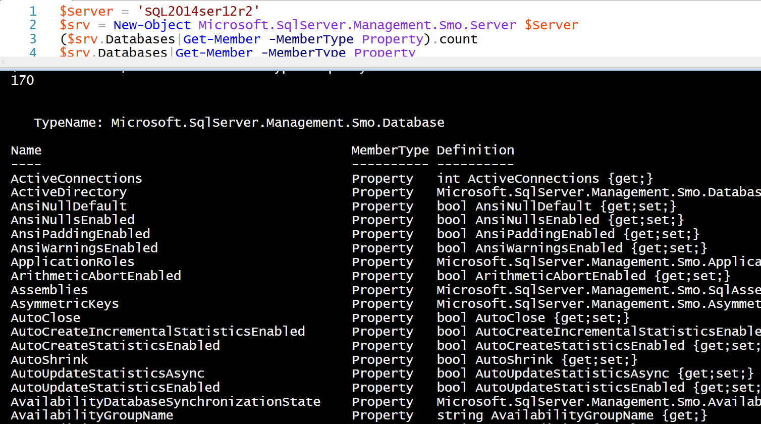
If you wish to view all of the different properties that you can gather information on in this way you can use this code to take a look. (This is something you should get used to doing when writing new PowerShell scripts)
| |
An alternative method of doing this is to set a variable to a $db and then to select all of the properties so that you can see the values and identify the ones you want. Again this a good thing to do when exploring new objects
| |
You can see from the screen shot below that there are 170 properties available to you on a SQL2014 instance. You can gather any or all of that information as long as you ensure that you have the columns with the correct data types in your table and that your script has the logic to deal with properties that do not exist although I have had less issue with this for the database object than the server object
You can look for the property that you want by using the Get-Member cmdlet as shown above or use MSDN to find it starting from here or by GoogleBingDuckDuckGo ing “PowerShell SMO” and the property you wish to find.
The rest of the script follows exactly the same pattern as the previous post by checking the SQL Info table for an entry for that instance and updating the table if it exists and inserting if it does not.
This is how I created the reports shown above.
Connect to the DBA Database and run these queries to gather the data for the report.
| |
To get all the database and instance information and
| |
To get the client information. The client information needs to be manually added to the table as this (in general) needs a human bean to understand. When the script runs every night it will pick up new databases and I add a default value of “Not Entered” to the table which makes it easier to identify the databases that need this additional work. (This also means that as a Team Leader I can monitor that my team are doing this) It can also be added to any scripts which create new databases for deployment.
Then we need to create some measures and calculated columns for our report. I did this as I realised that I needed it when making the report rather than all up front.
I created two calculated columns for size for the databases one for Gb and one for Tb by clicking on the data icon on the left and then new measure
| |
Some measures for count of Databases, Instances and Servers
| |
I also wanted to be able to differentiate between ‘External’ and ‘Internal’ customers. So I created a calculated column for this value using a switch statement.
| |
I create a donut chart to show the size of the database in Gb by client (and no, my real clients are not rock bands :-) ) as shown below. I formatted the title, legend and background by clicking on the paintbrush in the visualisation pane. I would encourage you to investigate the options here.
 The other donut chart is number of clients per location (and those are SQL User group locations in the UK and my hometown Bolton)
The rest of the visualisations on that report are cards and tables which I am sure that you can work out.
I created a map to show the location of the databases
And after reading this post http://sqldusty.com/2015/08/03/power-bi-tip-use-the-treemap-chart-as-a-colorful-slicer/ by Dustin Ryan I created a colourful slicer for environment and the client and then added some other information. The important thing here is to pick the information that the person looking at the report needs to see. So if it is recovery model, compatibility level, collation, page verify setting, mirroring, replication, size and number of databases then this report is correct but I doubt that’s what you want :-)
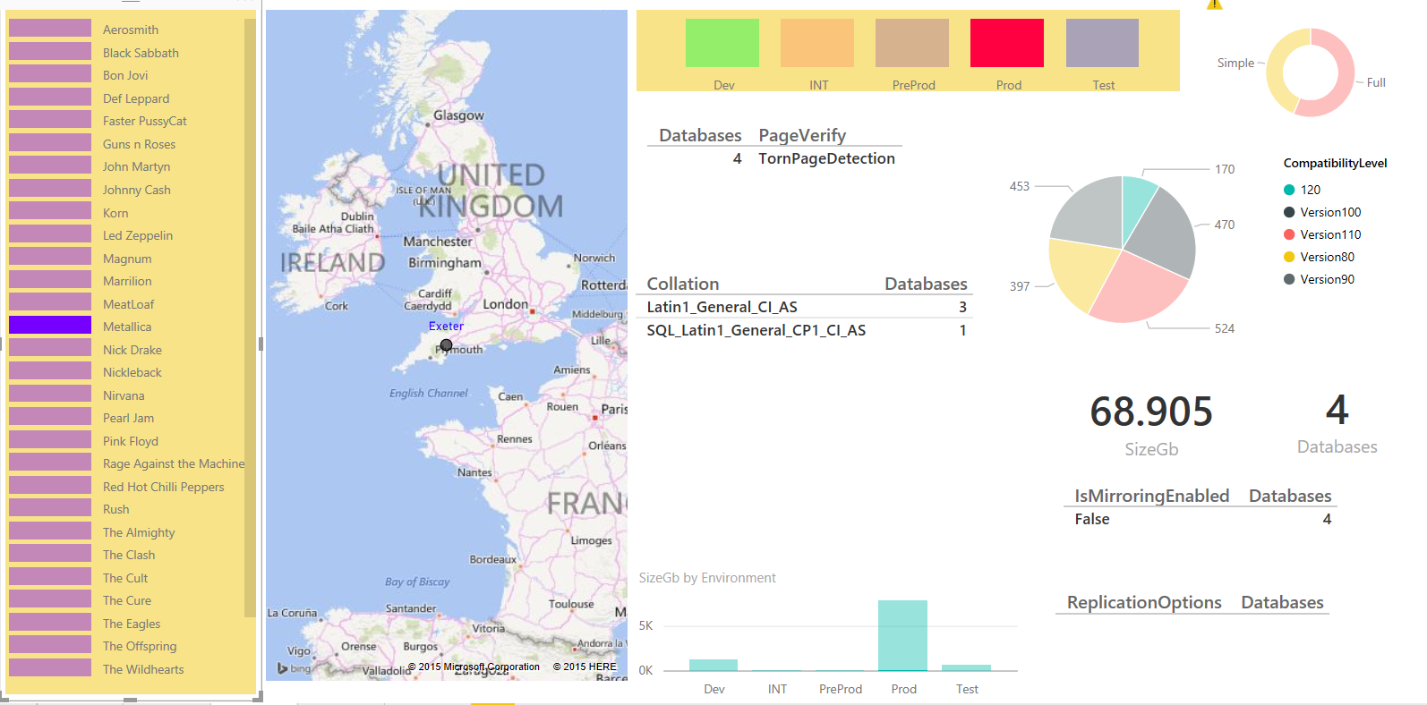
You can slice this report by location, client or environment. For example, I can easily see which clients have data in Exeter and the size and number of databases
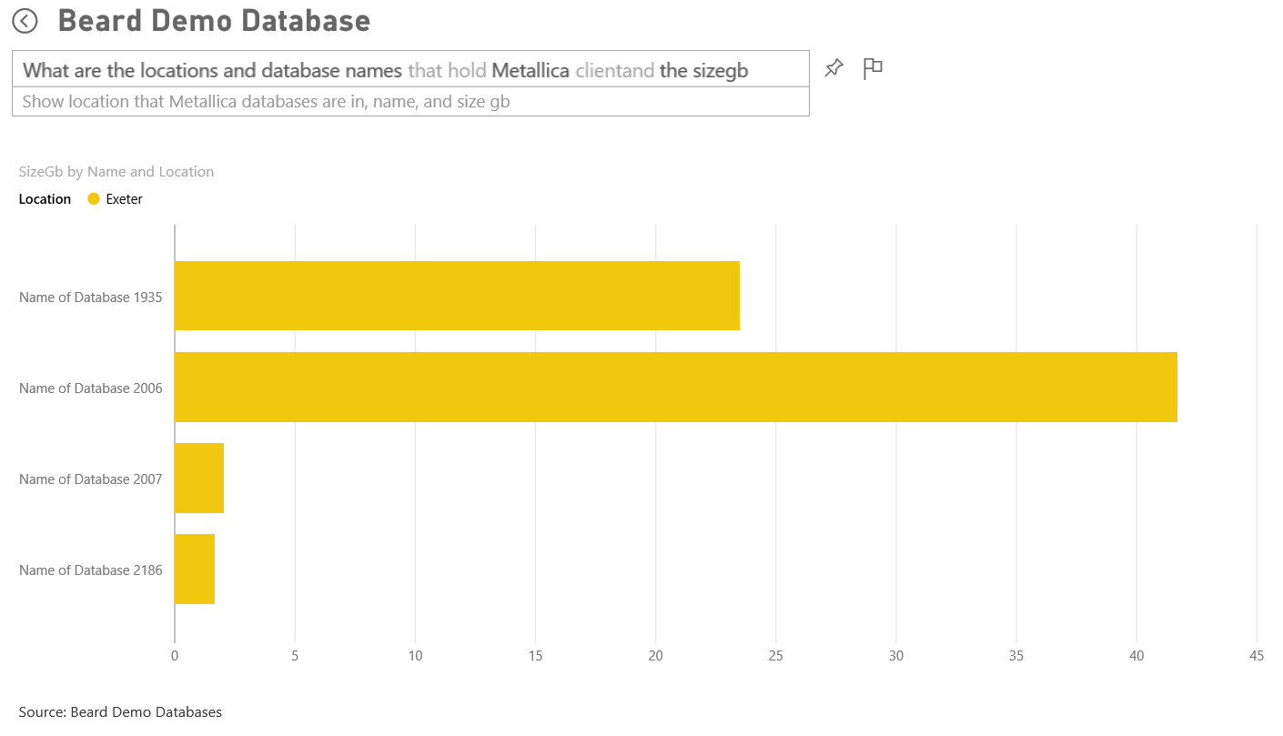
Or if Metallica ring me up I can quickly see that they have 4 databases, just under 69Gb of data in Exeter and it isn’t mirrored. You will notice that it is not easy to see the recovery model or the compatibility level. If you hover over the results you get a highlight figure which shows the data is filtered but it is not shown visually very well as there are over a thousand databases using full recovery model.
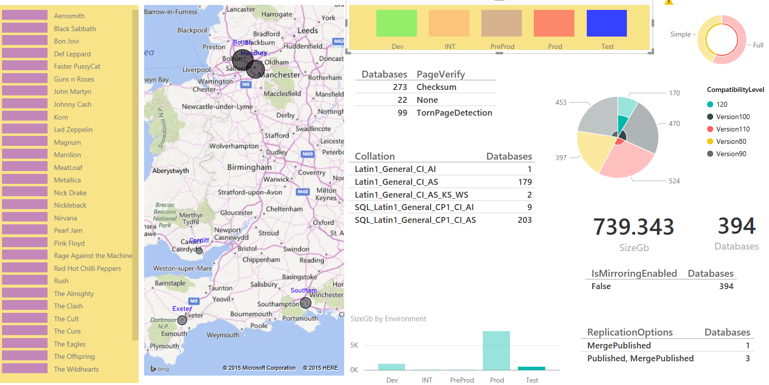
If we are asked about the Integration environment we can see that it is hosted in Bolton, Manchester, Southampton and Exeter and comprises of 394 databases and 739 Gb of data. It is also easier to see the compatibility level and recovery model as the ratios are larger
Once we have created the report in the way that we want we can then publish it to powerbi.com and share it with others if we wish. Publishing is as easy as pressing the publish button and entering your powerbi credentials but if you want your data to automatically refresh (and this is the point of the exercise to remove manual work) then you will need to install and configure the PowerBi gateway and schedule a refresh I will post about this later.
Once the report is published you can access it in the browser and create a dashboard by clicking the pin in the top right of a visualisation and a pop up will ask you which dashboard you wish to pin it to (Another recent update to Power Bi)
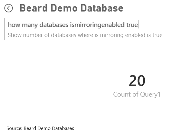
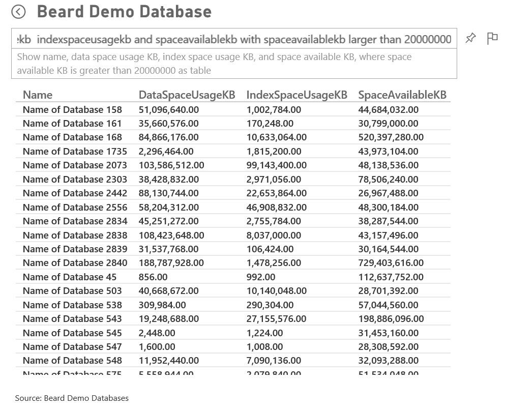
Once you have a dashboard you can then perform some natural language question and answer on it. This can be quite interesting and not always quite what you (or your report readers) might expect but it is getting better all the time
You have to remember to use the names of the columns correctly
But once you have the query correct you can alter it by adding “as a VISUALISATION” and choose the visualisation
And once you have the visualisation you can pin it to the dashboard
I think you can see how useful it can be
This doesn’t work quite as you expect
But this does
How about this (and yes it felt wrong to type!)
And the auditors would love to be able to do this. (This is an old copy of the database in case The Eagles people are reading this - your database is backed up every 15 minutes)
Or this for a DBA ( Yes, my obfuscation script database naming convention is a bit bland)
Or the DBA team manager might choose this one
The advantage that I cannot show via static pictures is that the data, visualisation and the suggestions alter in real time as you type
I hope that you have found this useful and that you can see the benefits and advantages of using a DBA Database and empowering people to use self-service to answer their own questions leaving the DBA time to do more important things like drinking coffee :-)
As always if you have any questions or comments please feel free to post them on the blog.
I have written further posts about this
Using Power Bi with my DBA Database
Populating My DBA Database for Power Bi with PowerShell – Server Info
Populating My DBA Database for Power Bi with PowerShell – SQL Info
Populating My DBA Database for Power Bi with PowerShell – Databases
